 |  |  |  |  |

  |

| S. S. Wilkins |
 Dec 27 2006, 08:18 PM Dec 27 2006, 08:18 PM
Post
#466
|
 Shy  Group: Arcs Posts: 39 Joined: 17-April 06 Member No.: 113 |
Meh....too lazy to scan in the competed version.
Tomoe from Kenshin~ 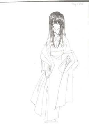 |
   |

 
|
| Rikane |
Dec 27 2006, 09:43 PM
Post
#467
|
|
Lazy Group: Arcs Posts: 20 Joined: 25-November 06 Member No.: 289 |
Nice, but here's a tip.
To prevent diporportionate features, make a small undersketch, then slowly and lightly draw in the details. That way you don't end up with tiny hands and giant heads. But still, read good nontheless <3 This post has been edited by Rzul: Dec 27 2006, 09:43 PM |
|
|
|
| DustyHaru |
Dec 27 2006, 11:54 PM
Post
#468
|
 Check Length Group: Knights Posts: 916 Joined: 7-August 07 From: Check Length Member No.: 1632 |
:)
Yeah, I used to draw without them, then I tried it, failed at it for a while, then, later, i tried it again, and decided it worked for me. But I still feel that it's disproportionate sometimes (I'm not very good at deciding how long something should be). Or making different poses. Any help? Hmm, now that I look at it, it doesn't (in my opinion) look as off in the fully shaded version. Maybe I should scan that...someday. This post has been edited by Buddhu23: Dec 27 2006, 11:56 PM |
|
|
|
| Raijinili |
Dec 28 2006, 09:20 AM
Post
#469
|
 Lieutenant Group: Gods Posts: 2539 Joined: 25-December 05 Member No.: 16 |
Honestly. I think apart from the small hands, the missing feet and the slightly disproportioned shoulder, everything looks fine. The eye looks normal, the head shape is fine and the hair shading is well done.
But what i suggest you do, is make sure your person doesn't lean to the side abit when he stands. Drawing big stuff usually makes it harder to adjust, so your character might come out looking like he's leaning to the right, like yours is. You can make a straight line with a ruler to make sure that its body is completely in line. At least, that's what i did, when i was abit younger. xD Otherwise, great job. Give or take another year or so and you can adjust without using the ruler or stick figures. But then again, stick figures are probably the best bet one has on poses and body-length proportions. xD ~~~  |
|
|
|
| MeleMewChew |
Dec 28 2006, 05:43 PM
Post
#470
|
 Bitchy Whore Group: Naughty Children Posts: 43 Joined: 11-January 06 Member No.: 42 |
BUDDHU. Try drawing stick figures. Yes, I'm completely serious xD. Stick figures will help you plan out your drawing. No, I don't mean the ones people did in first grade, with the arms coming outta the head and the head about the same size as the body xDD. That wouldn't help very much. It's kinda... like... ummm... think of it as the skeleton... or something. But... it's still a stick figure. Only a FANCY stick figure. Use a circle or something (or a square, if... um.. you want xD. I know my friend likes using triangles..) for the head, to plan out how large you want it. Then use lines and stuff to figure out the width of the shoulders, the length of the upper arms, lower arms, back, etc etc. Try and mark up where you want the joints to be, too (using circles... or squares... or um.. triangles :\) This way, you can put the character into poses, and if you don't like the way the pose is turning out you can always change it without worrying too much about losing details and stuff. I MUST SOUND REALLY CONFUSING RIGHT NOW. AND I APOLOGIZE FOR MY INABILITY TO EXPLAIN THINGS.
But some people don't like doing that. MAYBE BECAUSE THEY HAVE SOMETHING AGAINST POOR STICK PEOPLE. ): ): Or maybe it just doesn't work for them. BUT UM. I tend to do this quite a bit. But sometimes I get lazy and just eye the proportions. Which usually turns out alright for me... but it doesn't work for everyone. AND IF STICK FIGURES DON'T HELP. Try eying it. Lightly do your drawing without adding too much detail, then fix whatever doesn't look right. Then go in and add all the details when everything looks ok. BUT IF NOTHING WORKS DON'T GIVE UP OK. You'll figure out a way to do things that's easy for you eventually. THAT WAS A REALLY LONG POST. I BET IT MADE NO SENSE. IT'S A REALLY NICE PICTURE BY THE WAY. I can't really see it. Maybe my screen is set too bright or something xD. But the hair is nicely shaded. The folds in the clothing are nicely done. C: This post has been edited by Liger: Dec 28 2006, 05:47 PM ~~~ GO GO EMO RANGERS YOU MIGHTY MOSHIN' EMO RANGERRRRS!
<MeleMewchew> Bitchy whore bleeding heart emo ranger power! |
|
|
|
| Sajo |
Dec 29 2006, 08:26 AM
Post
#471
|
 Lazy Group: Arcs Posts: 21 Joined: 7-January 06 From: VA, USA Member No.: 39 |
See? We both agree it rocks and that stick figures are awesome.
Maybe someday i'll scan a few pages of my multiple artbooks and just link it to you. I'm sure you'll find some quite useful. They mostly include stick figures, like Liger said. And perspective. Perspective rocks. Anyways, to appease your appetite for (shall i assume anime?) drawing, i've found a website i used to go to two years ago. Art site here. This post has been edited by Swiyth: Dec 29 2006, 08:37 AM ~~~  :The Solitary Angel, Ledah: You are quiet and reserved though your love of solitude doesn't keep you from making contact with others. Not given to sharing aspects of your personal life and history, you value loyalty above all else and present a very sophisticated and cultured, if remote, front. <br><br><a title="Take this quiz at Quizilla" href="http://www.quizilla.com/redirect.php?statsid=57&url=http://quizilla.com/users/Stroud-chan/quizzes/Which%20Riviera%3A%20The%20Promised%20Land%20character%20are%20you%3F"> Which Riviera: The Promised Land character are you?</a><BR> <font size="-2">brought to you by <a title="Quiz, Horoscope, Flash Games, Poems - Quizilla!" href="http://www.quizilla.com/redirect.php?statsid=56&url=http://www.quizilla.com">Quizilla</a></font> |
|
|
|
| Disaresta |
Dec 30 2006, 05:18 PM
Post
#472
|
 Lazy Group: Arcs Posts: 14 Joined: 25-December 06 Member No.: 420 |
I wanna post too but imageshack hates my drawings, can anyone tell me a nice imagehosting site.
mari's coloring skill are really great and desus drawings are so cute i wish i could draw chibis too. |
|
|
|
| Ethereal Citizen |
Dec 30 2006, 08:27 PM
Post
#473
|
 Lazy Group: Arcs Posts: 15 Joined: 21-May 07 Member No.: 1336 |
Hell, I don't even remember if I posted these before...
TRINITY ^A pic of my RP, plus lightningdude's and Swifty's. Done in pen, so forgive the crappiness. LIBERARE ^A sketch of lightningdude's RP, Liberare Venegier, also in pen. Done some time ago, and I won't be posting any new pics until I get my hands on a working scanner, the same reason I couldn't submit my awesome contest entry. |
|
|
|
| tcaudilllg |
Dec 30 2006, 11:10 PM
Post
#474
|
|
Shy Group: Arcs Posts: 30 Joined: 25-December 07 Member No.: 1672 |
um here's mine
blelahblelahblelah heres another blelahblelahblelah This post has been edited by Cursed Seraph: Dec 30 2006, 11:13 PM |
|
|
|
| Miki Trie' |
Dec 31 2006, 02:40 AM
Post
#475
|
 Yush, I killed it. Group: Sprites Posts: 254 Joined: 24-October 09 From: Searching... Member No.: 1986 |
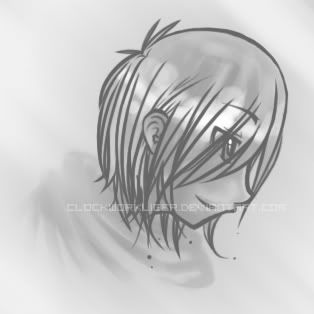 It was originally in pink. And then I was all NOO. THAT SHADE OF PINK IS GODAWFUL. So I made it greyscale, instead. I would've changed it, but I was smart and did all the coloring on the background layer. So whatever. I wasn't really going for pretty coloring anyways. I just wanted to do thick lineart because I haven't done thick linearts in forever. >_> I also wanted to make sure I was still capable of making neat lineart xD; GUHHH. I am so bad at drawing people-esque things ;__; Lineart took 37 damn layers. |
|
|
|
| WhiteKnight |
Jan 1 2007, 03:45 PM
Post
#476
|
 *obnoxiousaltcaps* Group: Arcs Posts: 304 Joined: 10-April 07 From: SOMEWHERE NOT UPSTATE NEW YORK Member No.: 1010 |
Good job Liger!!^^ I really like it, and I'm glad you didn't make it in pink (I hate pink >.< lol)
I like the way you shaded the hairs!! So: 9/10!!^^ ~~~ Yar har ho.
Yo ho har. |
|
|
|
| Takeru-kun |
Jan 2 2007, 02:06 AM
Post
#477
|
 Shy Group: Arcs Posts: 33 Joined: 27-December 05 Member No.: 24 |
Ooh, very nice~~
Just one little thing that I noticed is that the head seems to be a bit long at the top end...either that, or the forehead near the hairline seems to start a little far back. |
|
|
|
| Tyros Arcainix |
Jan 3 2007, 06:36 PM
Post
#478
|
 Lazy Group: Arcs Posts: 11 Joined: 27-March 07 Member No.: 893 |
That is soooooo cute Liger. XO
And I love your icon. ~~~  |
|
|
|
| sandpenguin |
Jan 3 2007, 10:02 PM
Post
#479
|
 3 Years passed and it all make a difference. Group: Flunkies Posts: 397 Joined: 4-August 07 From: Bolehland, go figure. Member No.: 1630 |
Thanks C:
 Mufufufu, I figured out how to make these cute rounded stars in Photoshop xD, so much fun. Yes, that cat is ugly. I'm sorry. The colors remind me of coffee... or tea or something. This post has been edited by Liger: Jan 3 2007, 10:08 PM ~~~  Governance is frickin hard. Governance is frickin hard. |
|
|
|
| Ryu_Dragon_King |
Jan 3 2007, 10:35 PM
Post
#480
|
 Stupider than stupid Group: Naughty Children Posts: 36 Joined: 30-January 06 Member No.: 55 |
Lines!! <3!
Do you vector using Photoshop or something else Liger? ~~~ I am a stupid moron and didn't think the admins could figure out I was being a little shit. D'oh!!
|
|
|
|
|
3 User(s) are reading this topic (3 Guests and 0 Anonymous Users)
0 Members:
| Lo-Fi Version | Time is now: 13th July 2025 - 12:12 AM |
Invision Power Board
v2.1.4 © 2025 IPS, Inc.