 |  |  |  |  |


| Skie |
 May 9 2010, 10:12 AM May 9 2010, 10:12 AM
Post
#1
|
 Lazy Group: Arcs Posts: 12 Joined: 15-March 08 Member No.: 1708 |
Finishing request from Hayashi Tenshi. Daring to use color instead of black and white
Hopefully satisfying^^ (Man, I spent 4 hours to make it...) 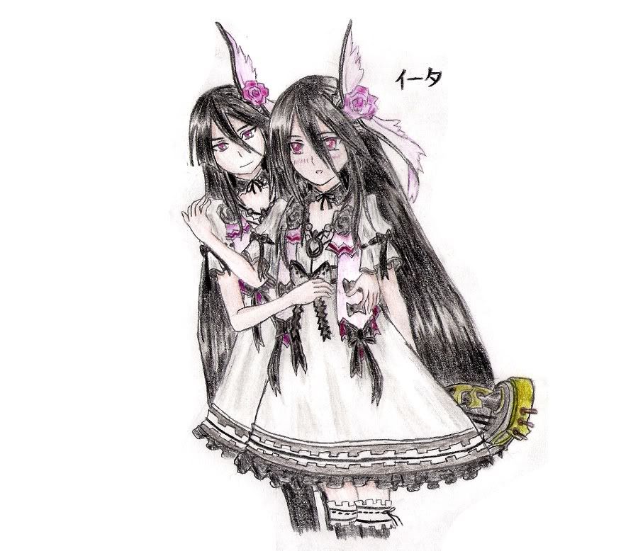 ~~~  |
   |

 
|
  |
Replies(1 - 4)
| Dr Strum |
May 9 2010, 04:36 PM
Post
#2
|
 Can Lead the Nation with a Microphone  Group: Angels Posts: 5427 Joined: 23-December 05 From: Seattle Member No.: 1 |
AWSOME!! XD
~~~ Писатель всегда будет в оппозиции к политике, пока сама политика будет в оппозиции к культуре.
|
|
|
|
| Nanashi |
May 9 2010, 07:08 PM
Post
#3
|
|
Fenrisulfr Group: Arcs Posts: 286 Joined: 5-February 06 From: Millington, TN Member No.: 61 |
I really like it! Thank uu!!
|
|
|
|
| untouch |
May 10 2010, 02:44 AM
Post
#4
|
 Lazy Group: Arcs Posts: 24 Joined: 27-December 05 Member No.: 23 |
The front one's right thumb should be cut deeper into the hand. The gap between the index and middle finger should be deeper, too: the ends of the gaps should form an arc that bends inwards. The chop side of the hand shouldn't bulge out so much; on the flip side, the thumb side of the hand should have a clear bulge near the wrist (look at your own hand). As it is, the thumb seems to grow out of the middle of the side of the hand. The upper forearm should be a little longer, since the length from the elbow to the shoulder is about the same length as the length from the elbow to the middle of the palm.
The front one's legs don't seem to extend correctly from the torso: the legs seem to be at an angle that suggests the torso is about 100-200 pixels to the (viewer's) right of where it actually is. The back one seems to be off her legs too. Since the leg is almost parallel to the body, the legs should appear in an area that's contained in a rectangle coming from the shoulders (i.e. they should not go out from under the shoulders). The perspective of the legs in relation to the torso might be helped by considering the body without clothing before the clothing is drawn in. === All that said, it's very pretty and I like it. ~~~  Things change, things really change |
|
|
|
| Midnight |
May 10 2010, 04:43 AM
Post
#5
|
 et Omnia Vanitas Group: Flunkies Posts: 296 Joined: 2-July 08 From: Minnesota Member No.: 1755 |
Thank Raij|Away! Now I know some mistake from my pic.
When drawing something detail, sometimes I forgot to re-checked some minor mistakes. Your comment really help ~~~ |
|
|
|
|
1 User(s) are reading this topic (1 Guests and 0 Anonymous Users)
0 Members:
| Lo-Fi Version | Time is now: 23rd April 2025 - 09:24 PM |
Invision Power Board
v2.1.4 © 2025 IPS, Inc.