Feral Phoenix
Sep 11 2006, 05:26 PM
Seans
Sep 11 2006, 08:16 PM
I like the Princess Bride one. It's so.... colourful. XD
Dr Strum
Sep 12 2006, 01:14 AM
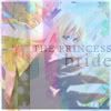
The word is not "colourful," it's "crappy."
Seriously. The Yggdra bathscene is hard enough to make out without applying a bunch of cloud crap effects.
And one more thing about it, what the fuck do you mean by "Princess Bride?"
Liger
Sep 12 2006, 01:26 AM
I think they're quite nice, although, with textures and stuff you could try lowering the opacity of the texture layer or something. I dunno. I suck at making pretty icons and fail at Photoshop effects and such, but it looks like the problem might be that the opacity is set too high.
I dunno. That's my lame suggestion :\
I've never used textures before, so I'm not too sure how they work. You could also try different blending options (such as screen, overlay, etc.) on the texture layer.
Ahh, I have no clue what I'm talking about. Ohwell. If I make absolutely no sense, sorry XD;
Feral Phoenix
Sep 12 2006, 12:19 PM
Seans: Thank you, I like that one too.
Liger: If the opacity were lowered any more, the text would no longer be visible. And you're SUPPOSED to be able to see the pattern.
Sturm: LIKE THE MOVIE, DUMBASS. Once again, I don't see you bending over backwards to contribute to anything other than stupid whinings and site maintenance. :<
Dr Strum
Sep 12 2006, 03:10 PM
Not to be an elitist, but, Feral, that is the stupidest thing I have ever heard.
"I make icons (e.g. crop artwork to 100x100 and add cloud effects) so I'm better than the guy who pays for, codes and maintains the site that hosts them all~"
Malice
Sep 12 2006, 10:21 PM
if the picture was more clear on princess bride, it would look wonderful.
Marionette
Sep 12 2006, 11:43 PM
Sometimes your textures overpower the image, remember that they're only supposed to be little flavors that we can pick up and go "ooh", not something that overpowers the dish itself.
BAM!
Greifer
Sep 14 2006, 11:20 AM
I like the Fia icon, it's subtle but nice.
Feral Phoenix
Sep 14 2006, 12:20 PM
QUOTE(Marionette @ Sep 12 2006, 11:43 PM)

Sometimes your textures overpower the image, remember that they're only supposed to be little flavors that we can pick up and go "ooh", not something that overpowers the dish itself.
BAM!
Eh, well, that's the problem with that set of icon/textures; since the text is included with the texture, it's sometimes hard to fix it so that both are just right.
That icon might have been able to stand getting its texture opacity lowered a bit, but... you know. *shrug*
Dr Strum
Sep 14 2006, 01:28 PM
Wait, you didn't make the text either?
Was any of it your doing aside from assembly?
Malice
Sep 15 2006, 12:32 AM
Feral, Get the eraser and mess with the opti..whatchamacallit. then erase. Retype the words. D:
ChefMKT
Sep 15 2006, 04:59 AM
Opacity?
Malice
Sep 15 2006, 11:40 PM
yes. :3
This is a "lo-fi" version of our main content. To view the full version with more information, formatting and images, please
click here.